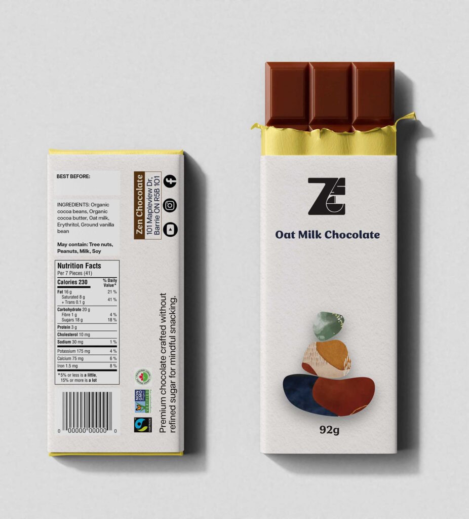
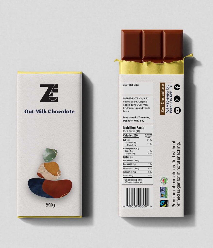
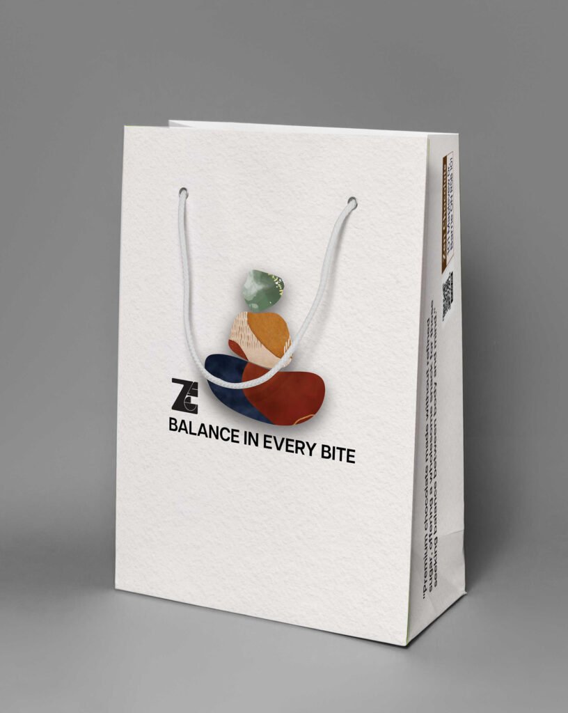
packaging Project

Zen chocolate

Label Design

The packaging design was developed to reflect the brand’s intended style—calm, premium, and wellness-oriented—while staying connected to nature. To support this concept, the packaging uses imagery and material choices that highlight the natural character of paper, emphasizing an organic texture and a soft, tactile feel that reinforces authenticity and quality.

Flat lay of chocolate packaging with an unwrapped chocolate bar, showing nutrition facts and the “Oat Milk Chocolate” front panel.
Two chocolate bar package mockups showing “Oat Milk Chocolate” front and back, with a stacked-stone logo and 92g label.

Shopping Bag Design

For the shopping bag, the side panels were treated as an active design space rather than left blank. By extending the graphics and composition onto the sides, the bag gains a more dimensional, sculptural presence, creating a stronger visual impact from multiple angles and enhancing the overall premium experience.

White paper shopping bag mockup with rope handles and “Balance in Every Bite” branding with an abstract stacked-stone graphic.
Angled view of the same branded shopping bag, showing side panel details and the abstract stacked-stone logo.